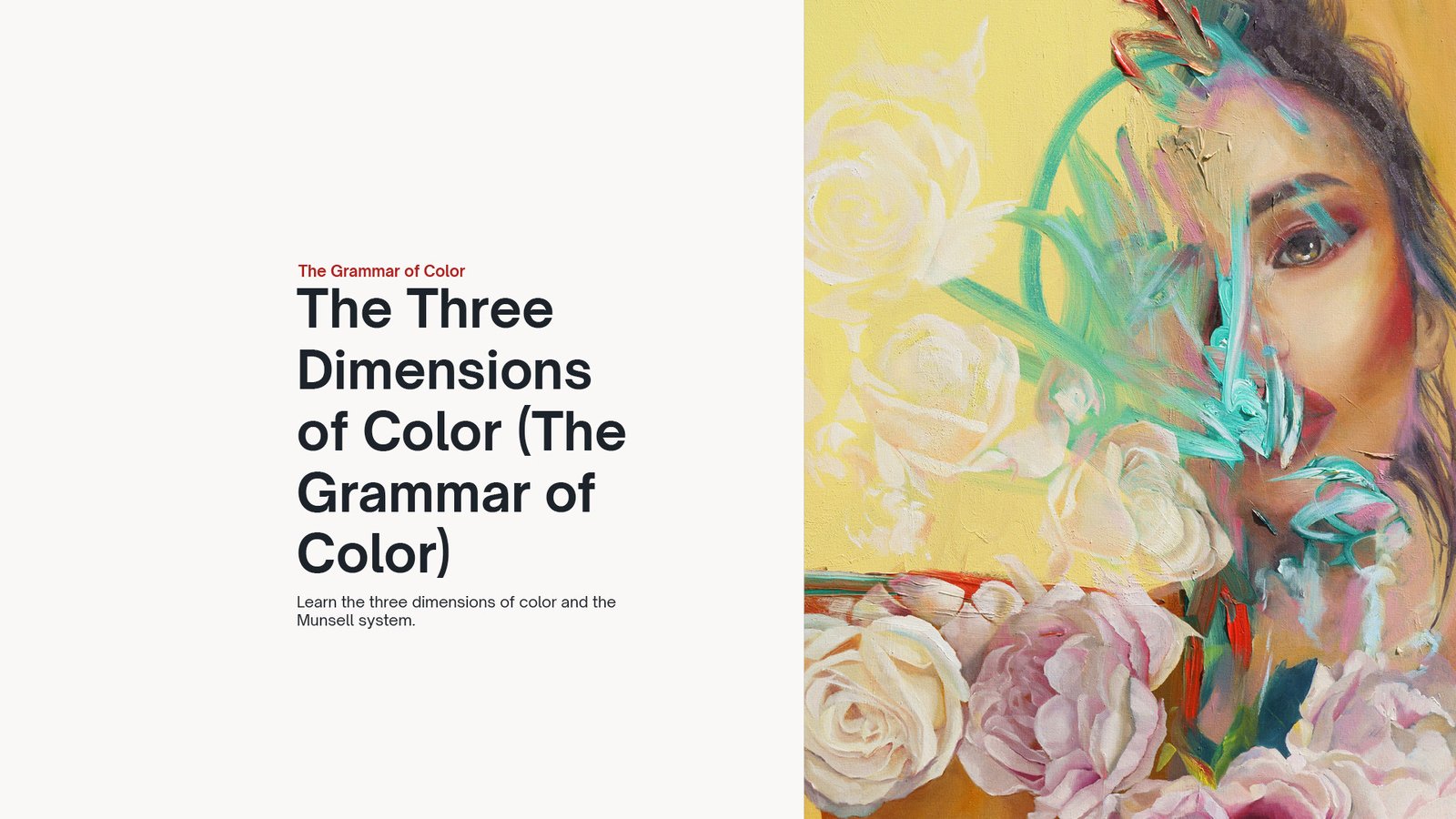
The Three Dimensions of Color
What actually allows a painter to control color instead of guessing it?
In this lesson, we step into the core structure of color. The Three Dimensions of Color, what we can call the true grammar of color. This is the system that allows you to organize what you see and translate it into something intentional and believable.
Because painting is not about choosing beautiful colors. It is about understanding how color works and how its components interact with each other.
Value, hue, and chroma are the three dimensions that define every color you will ever see.
Some definitions to help you along the way
Value
The lightness or darkness of a color: the scale that determines how light or dark it appears.
Hue
The identity of the color: The quality that distinguishes one color from another (red, yellow, green, blue, purple).
Chroma
The strength of the color: the intensity of a hue, ranging from neutral gray to full saturation.

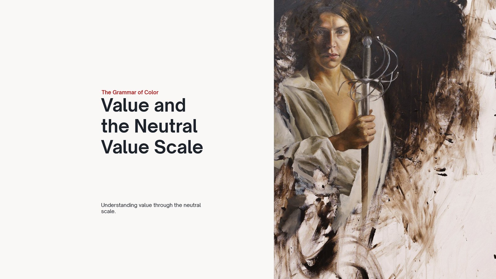
Value and the Neutral Value Scale
In this lesson, we step into one of the most fundamental pillars of painting: value. Understanding value means learning to see beyond color, and to recognize the true structure that gives form, depth, and clarity to everything you paint.
You’ll explore what value really is and why it matters more than anything else when building a believable image. Through the concept of the neutral value scale, you’ll begin to organize light and dark with intention, training your eye to measure relationships instead of guessing.
This is where painting starts to shift from intuition to control. Once you understand value, every color decision becomes clearer, and every form begins to make sense.
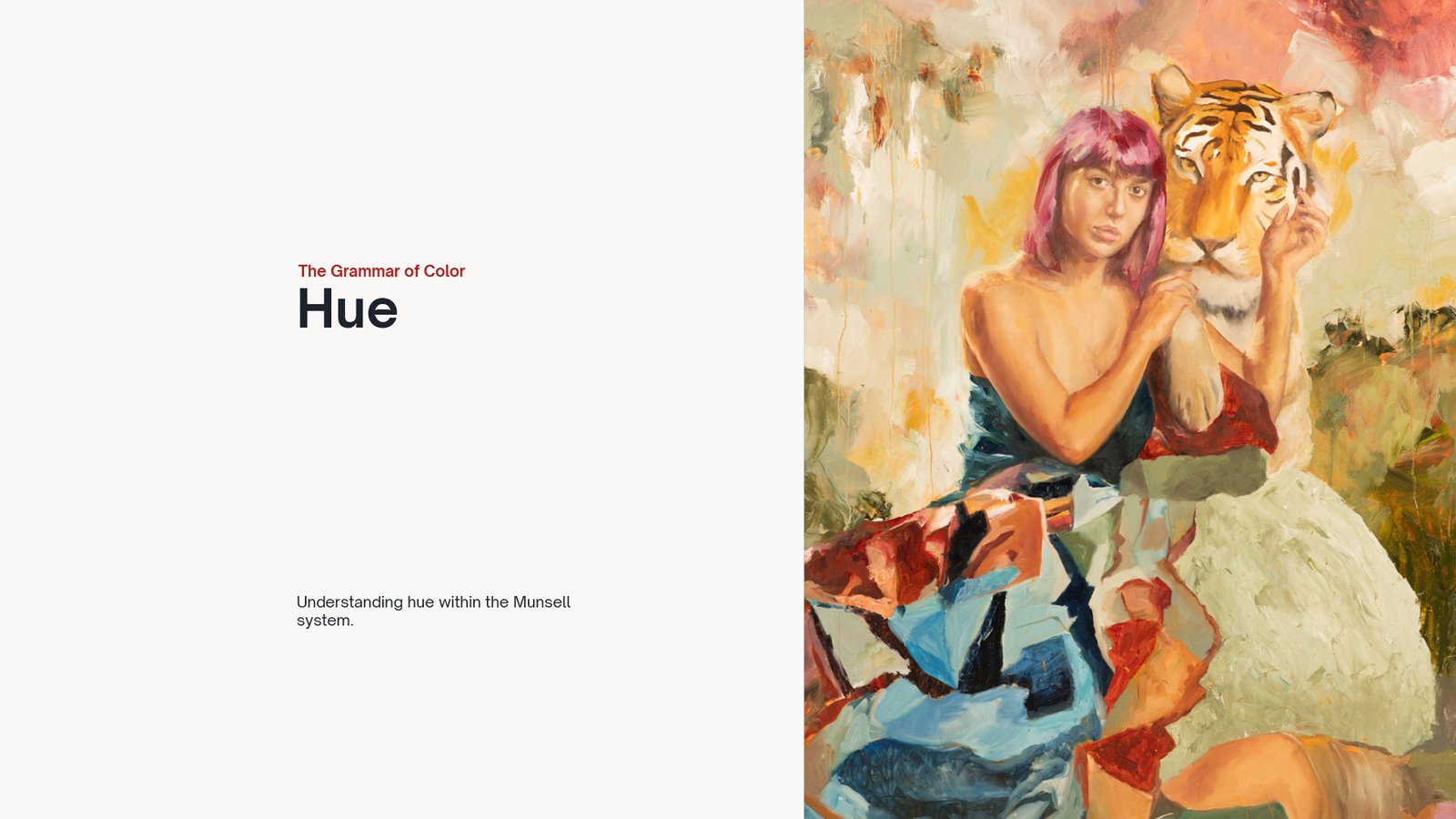
Hue
Why is the word "color" not adequate?
What colors is your eye more sensitive to, and why?
Why do some color combinations feel naturally right, while others feel completely off?
What creates harmony in a painting, and what creates tension?
In this lesson, we move into hue, the dimension that gives color its identity. You’ll begin to understand that what we casually call color is not a single thing, but a structure made of multiple dimensions. Without separating them, clarity is impossible.
You’ll also see how the human eye responds more strongly to certain areas of the spectrum, and how this influences the way you perceive and organize your painting.
From there, we explore color harmony and color contrast as tools, not theories. Harmony creates unity, contrast creates separation. Together, they allow you to control attention and build intentional images.
This lesson expands what we introduced with value and brings you closer to understanding color as a language you can actually use with precision.
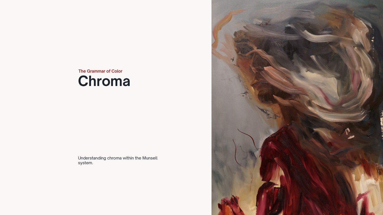
Chroma
What makes a color feel powerful… or completely dull?
Why do some colors look alive, while others feel almost gray, even if they’re technically the same hue?
In this lesson, we complete the structure of color by diving into chroma, the element that defines the strength and intensity of a color. While hue tells you what color you’re looking at, and value tells you how light or dark it is, chroma determines how vivid or neutral that color appears.
Understanding chroma changes the way you see everything. It allows you to control focus, create depth, and avoid the common mistake of over-saturating your painting. This is where many artists lose control, because without a clear structure, intensity becomes guesswork.
In this video, you’ll learn how chroma behaves and how it relates to value and hue.
The Munsell System
In this lesson, we bring hue, value, and chroma together into one practical system: the Munsell system.
Instead of treating color as scattered theory, you’ll start to see how these three dimensions work together inside a clear three dimensional structure that helps painters organize, judge, and control color with much more intention.
This is where color begins to feel less abstract and far more usable in real painting practice.
Introduction to the Painting Palette
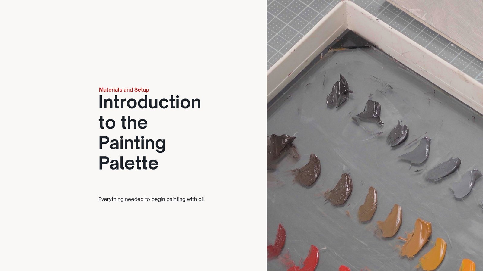
In this lesson, we take the Munsell system out of theory and begin translating it into a working painting palette. You’ll see how the structure of hue, value, and chroma can guide your choices on the palette, turning abstraction into something you can actually use.
This is still a conceptual step, but it sets the foundation for the exercises that follow. We’ll start building key scales that every painter should master: the value scale, the yellow scale, and the red scale. These will become your tools to organize color with clarity and control, preparing you to move from understanding… to execution.