Simultaneous Contrast: How Surrounding Colors Influence Perception
One of the most fascinating aspects of color theory is that we never truly perceive a color in isolation. What we see is influenced by the colors surrounding it. A color may appear lighter or darker, warmer or cooler, more saturated or more muted, depending on the colors placed next to it.
This phenomenon is known as simultaneous contrast, a fundamental principle of color theory that plays an essential role in painting, visual perception, and design.
Understanding simultaneous contrast allows artists to look beyond individual pigments and begin to understand color as a system of relationships.
Let’s start with a simple gray strip. As you look at the following image, follow the strip from left to right across the background. Do you notice anything unusual?
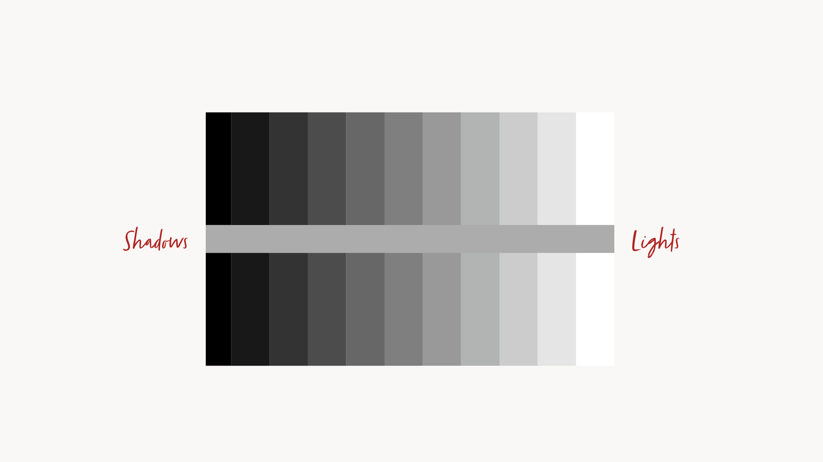
The strip appears to become progressively darker as it moves toward the right. And yet, its actual value never changes. What changes is our perception, shaped by the contrast between the strip and the values surrounding it. The very same tone can look lighter or darker depending on the context in which we see it.
What Is Simultaneous Contrast?
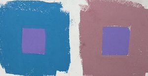
Simultaneous contrast describes the phenomenon in which a color appears different depending on the color immediately surrounding it.
When two different colors are placed next to each other, our visual system automatically compares their characteristics. As a result, their perceived appearance changes according to their interaction.
This influence can affect three fundamental properties of color:
- Hue: A color may appear to shift toward a different color family depending on its surroundings.
- Value: A color may appear lighter or darker depending on the relative brightness of the adjacent color.
- Saturation: A color may appear more vivid or more muted depending on the intensity of its surroundings.
In other words, the color we perceive is not determined exclusively by the pigment itself, but also by its visual context.
The Historical Origins
 The principle of simultaneous contrast is closely associated with the work of Michel Eugène Chevreul, a French chemist who extensively investigated the interaction of colors.
In 1839, Chevreul published The Principles of Harmony and Contrast of Colours, a landmark work that explored how colors influence one another when viewed simultaneously.
His observations had a significant impact on painting, textile production, and the development of modern color theory. Artists subsequently explored these principles to create more complex and controlled color relationships.
This influence can affect three fundamental properties of color:
- Hue: A color may appear to shift toward a different color family depending on its surroundings.
- Value: A color may appear lighter or darker depending on the relative brightness of the adjacent color.
- Saturation (chroma): A color may appear more vivid or more muted depending on the intensity of its surroundings.
In other words, the color we perceive is not determined exclusively by the pigment itself, but also by its visual context.
Why Is It Important for Painters?
For painters, simultaneous contrast has very practical consequences.
A color that looks perfectly balanced on your palette may appear considerably different once applied to the canvas. The same mixture can look warmer, cooler, lighter, darker, or more saturated depending on the colors surrounding it.
This is particularly important when painting skin tones.
For example, a neutral flesh tone placed against a green background may appear slightly reddish by comparison. The same flesh tone placed against a reddish background may appear less warm or even slightly greenish.
The pigment mixture has not changed. What has changed is our perception of it.
This is why painters should avoid judging colors independently. Instead, they must constantly evaluate how each color interacts with the surrounding areas of the composition.
Simultaneous Contrast in Practice
There are several ways to observe simultaneous contrast in practice.
- Value relationships
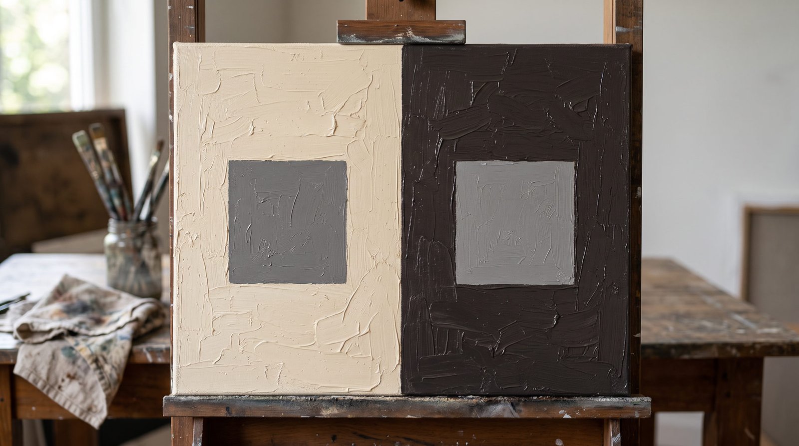
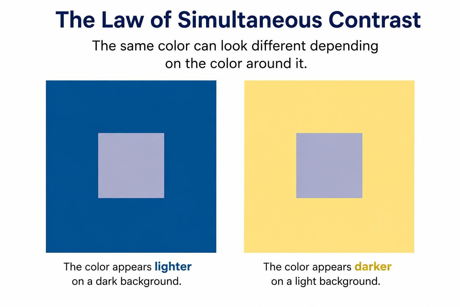
Place an identical gray square against a light background and then against a dark background. The gray will appear darker against the light background and lighter against the dark one. - Hue relationships
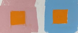
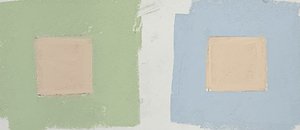
Place the same color against two different surrounding hues. Its perceived color will shift depending on the chromatic characteristics of the background. - Saturation relationships
Place an identical saturated color against backgrounds with different levels of chromatic intensity. Its perceived intensity may change as a result of the surrounding colors.
These simple exercises demonstrate why color perception is relational rather than absolute.
The Checker Shadow Illusion
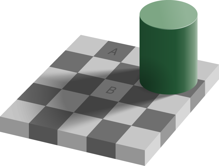
A fascinating example of how our visual perception can be influenced by surrounding elements is the Checker Shadow Illusion, created by vision scientist Edward H. Adelson. In this famous optical illusion, two squares on a checkerboard appear to have completely different shades: one looks considerably darker than the other. However, they are actually identical in color and value.
The illusion occurs because our brain does not interpret each square independently. Instead, it takes into account the surrounding squares, the shadow cast by the cylinder, and the perceived lighting conditions of the scene. Our visual system automatically compensates for these contextual factors, altering how we perceive the actual value of each square.
This is an excellent demonstration of why we cannot judge a color or value in isolation. What we perceive is strongly influenced by its surroundings, making the Checker Shadow Illusion a particularly clear example of simultaneous contrast and contextual color perception.
A useful practical technique: Isolating Color and Value
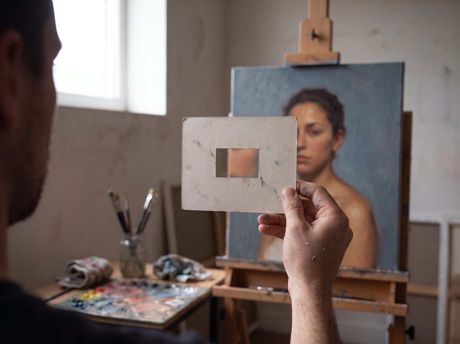
One simple technique I recommend is to create a small viewfinder using a piece of neutral gray cardboard with a hole cut into it. By placing this window over a color or a specific area of a painting, you can isolate that portion from its surrounding context and evaluate its value or hue more objectively.
This technique helps reduce the influence of simultaneous contrast and makes it easier to judge whether a color is actually lighter, darker, warmer, or cooler than you initially perceived. It is particularly useful when comparing subtle value transitions or checking color mixtures.
Final Thoughts
Simultaneous contrast reminds us that color is never a fixed fact. It is a relationship. The same mixture can look warmer, cooler, lighter or darker depending on what sits next to it, and your eye will always be tempted to trust the first impression.
So here is what I suggest when you paint. Never judge a color on its own. Step back and look at it in context. When something feels off, isolate it with your gray viewfinder, check it again, and then put it back in its place on the canvas.
Over time, you stop asking “What color is this?” and start asking “What is this color doing next to its neighbors?” That is the moment you begin to see like a painter.
Next time you mix a skin tone, try this: look at it on the palette, then look at it on the canvas, and notice how much it has changed. The pigment is the same. Only the context is different.


The Reilly Palette: Understanding the Reilly Neutrals
One of the biggest challenges in painting is learning how to control light and shadow. Colors may be beautiful and carefully chosen, but if their values are wrong, the illusion of form begins to fall apart.
This was one of the central ideas behind Frank J. Reilly‘s approach to painting. He believed that value played the most important role in creating the illusion of three-dimensional form on a flat surface. In his view, 80% of the result came from getting the values right, 20% from chroma, and none from hue.
To help artists develop this control, Reilly introduced a system known as the Neutral Control, built around a carefully organized scale of neutral values.
A system built around eleven values
The Reilly Neutral scale consists of eleven steps, ranging from pure black to pure white.
Black represents value 0, white represents value 10, and the nine intermediate steps fill the space between them.
The goal is to keep each step visually equidistant, creating a reliable reference for judging light and dark relationships in a painting.
But these neutrals are not simply made by mixing black and white.
Reilly’s system uses two different combinations of pigments:
- Titanium White and Ivory Black produce a series of cool grays with a slight blue bias.
- Titanium White and Raw Umber produce a series of warm grays with a yellow bias.
By combining the corresponding values from these two scales, the artist can create a third series of neutrals. The proportions are adjusted by eye until the warm and cool tendencies balance each other, producing a neutral color with minimal hue bias.
A north-facing natural light source can be particularly useful when judging these mixtures, helping the painter evaluate their neutrality more accurately.
Why neutral colors matter
The purpose of the Reilly Neutrals goes beyond establishing a value scale. They also provide a practical way to control the chroma of colors.
Oil paints often come straight from the tube with a high degree of saturation. While strong colors have their place, painters frequently need more subdued versions of those same colors.
Adding a neutral of the appropriate value allows the artist to reduce chroma while maintaining the original hue and controlling the value relationship.
Consider a simple example: suppose you want to create a muted purple at value 5, with a chroma level of 6 (P5/6).
You could begin with Dioxazine Purple, identified as P1/12, and add Titanium White until the mixture reaches value 5. Then, gradually introduce Neutral 5 until the purple reaches the desired level of chroma.
This approach gives the painter a more systematic way to adjust color, rather than relying on random mixtures or adding complementary colors that may shift the hue.
It is also important to understand Reilly’s terminology. He used the word neutral to describe a color without a significant hue bias. The word gray, on the other hand, can also refer to a weakly saturated color that still carries a recognizable hue.
Preparing the Neutrals Scale
The system was once available as a commercial product. In the late 1940s, Frank J. Reilly arranged for Grumbacher to manufacture boxed sets containing the nine intermediate Reilly Neutral values.
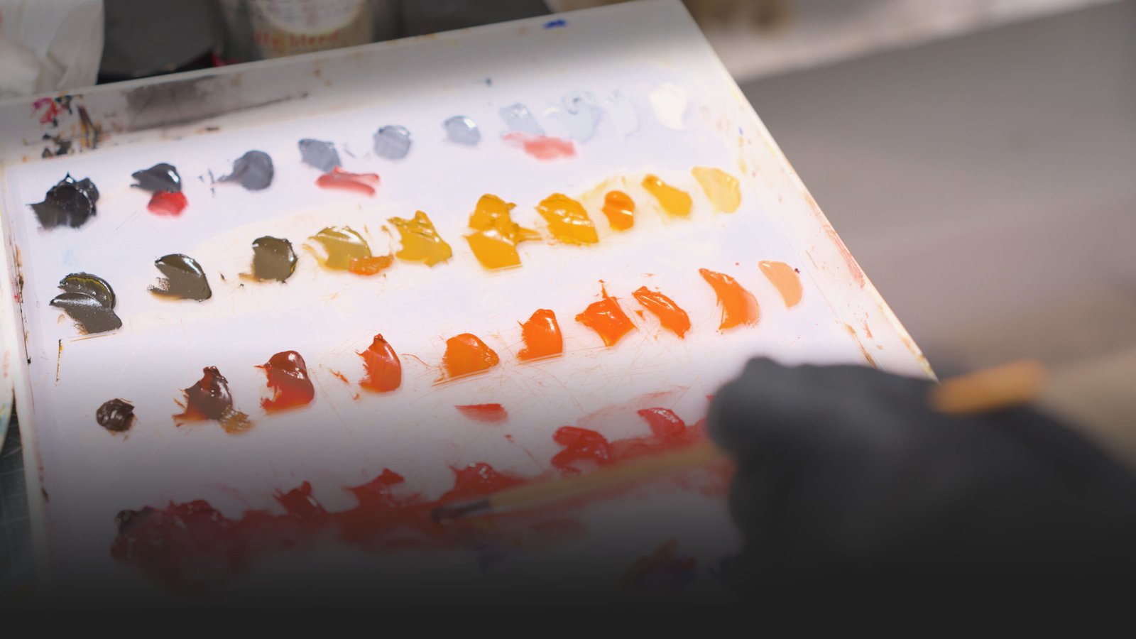
Those sets are no longer available, but making your own is relatively straightforward. Preparing them in advance can save considerable time during painting sessions and help maintain consistency across your palette.
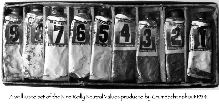
Understanding how neutrals work is an important step toward understanding the deeper structure of color. The Reilly Neutrals offer a practical way to explore the relationships between value and chroma, two elements that influence how colors interact and how we perceive them.
The process of creating the Reilly Neutrals scale, understanding how to achieve true neutral colors, and learning how to use them to control chroma are all explained in detail in The Silent Structure of Color.
The course explores these concepts and many other aspects of color theory, helping you understand how color works and how to apply that knowledge to your paintings.
The Secret of Realistic Painting
This article is primarily intended for artists who want to work in figurative art and improve their ability to represent the human figure, particularly in portraiture.
Portraiture, as well as the nude, has long been one of the fundamental areas in which artists throughout history have challenged themselves. These fields are incredibly rich in detail, knowledge, and technical advancements. It is therefore no surprise that some artists have reached such an extraordinary level of mastery that their work can seem almost impossible to match.
So, where should we begin? How can we develop a greater ability to represent the human form? How can we make our portraits feel more lifelike, more convincing, more realistic?
That is what I explore in this article.
What Matter More Than Details in Realistic Painting
If you think it’s the details that make the difference in a realistic painting, you might want to reconsider.
In reality, what truly makes the difference in a painting are the values. They are what create the illusion of three-dimensionality.
Because, ultimately, realism is simply the correct translation of a three-dimensional world into a two-dimensional one, which is the canvas.
And perspective, together with the variation of light that creates the illusion of depth, is the real work of the artist.
So, regardless of color and saturation, the first approach should be about values.
Therefore, one of the most basic pieces of information about painting, and one of the most fundamental concepts, is value.
One of the most challenging exercises that you will have to face is understanding, capturing, and rendering the correct values.
What Is Value in Art?
I have a complete dictionary entry for this word, but in a few words, value represents the relative lightness or darkness of a color or an area within an image.
Value represents the relative lightness or darkness of a color or an area within an image.
As I mentioned before, value is what allows us to represent form, which means the three-dimensional structure of a figure.
Do you understand now why this is one of the most important aspects of painting?
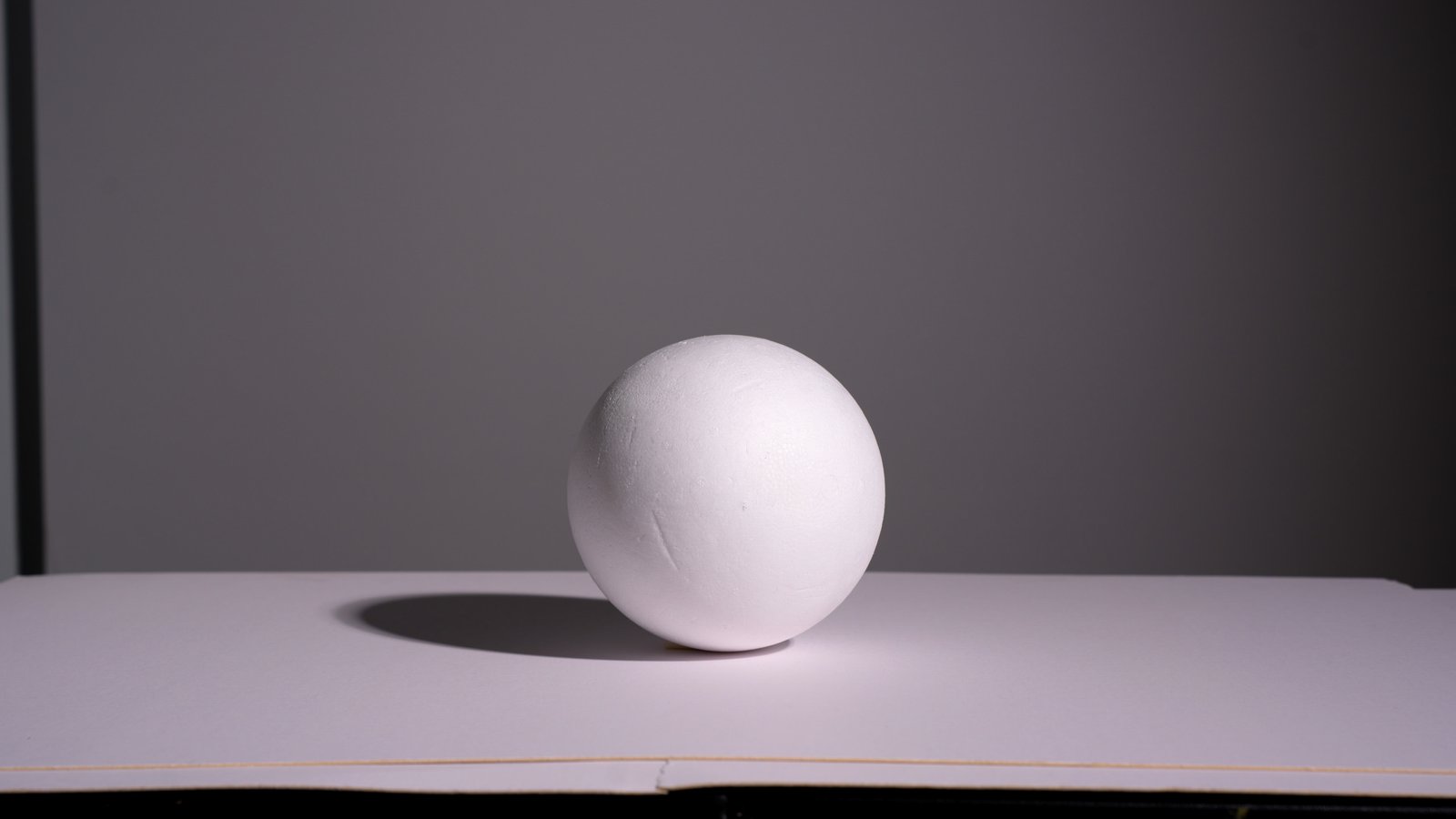
Because without value, you don’t have three-dimensional form. Without three-dimensional form, you don’t have realism. Without realism, your image, your painting, your portrait, or your figure can appear flat or incorrect.
We’re so used to perceiving values that our visual system is extremely sensitive to them. We instantly feel whether an image looks right or wrong based on the organization and accuracy of the values within the picture we are creating.
The Value Finder
Now that you understand the importance of value, it’s time to put it into practice.
I created this tool to help myself identify the correct values, and it is based on the Munsell system.
Now, I have an entire online course on the structure of color, so you can check out the course here. But I can give you some basic information.

This tool helps identify the relative degrees of light and dark, making it easier to understand and paint form.
You use it by taking a wooden stick and priming it with some gesso. Then, you divide it into 11 little squares. Those squares represent the values from pure black to pure white, where pure black is 0 and pure white is 10. This is the Munsell value scale.
You use this stick by squinting your eyes and comparing it with any color or area of your painting to identify its correct value.
Because one thing that I didn’t mention is that value and hue are two different attributes of color.
Every chromatic color has a hue, and hue refers to the color family, such as red, purple, yellow, green, and so forth.
So, when you squint your eyes, you can identify the value of a color regardless of its hue. This allows you to easily detect if you are moving in the wrong direction or if you have achieved the correct value relationship.
This is how simple this tool is.
I hope this helps. Let me know, and obviously, you can subscribe to my newsletter to receive these perks and free lessons directly in your email every week.
Stop Guessing Colors: The Formula That Changes How You Mix Paint
The goal of this article is simple: to help you gain more control and confidence when mixing and creating colors in your paintings.
This Procedure works for both Oil Colors and Acrylics!
Many artists, especially in the early stages of their journey, run into the same problem: mixing colors accurately.
With thousands of paints available in stores, I completely understand the confusion (and the frustration). If you’ve ever ended up with a palette full of dull, muddy, or simply “wrong” colors, you know exactly what I mean.
The good news is that this isn’t a lack of talent: it’s usually the result of an unstructured approach to color mixing. The internet is an amazing place: endless videos, endless artists, each with their own method… but is there a simple, reliable system?
Today I want to share a method that gives you much more control over color: separating the process into two distinct phases: value and color (hue and chroma).
Why Colors Become Muddy
Unlike light, which combines additively to produce white, pigments behave in a subtractive way. Each color absorbs certain wavelengths of light and reflects only what remains.
When we mix two pigments, each one absorbs certain parts of the light spectrum. In the mixture, these absorption patterns combine, so even more wavelengths of light get absorbed before anything reaches our eyes. As a result, less light is reflected overall, and the color often loses brightness and saturation, appearing more muted or gray. This is why mixes that seem logical on paper can sometimes end up looking dull in practice.
In painting, we also cannot reproduce the intensity of natural light. For this reason, much of our work revolves around building a range of colored grays, balancing warm and cool variations to create depth and realism.
The Separation Method: Value First, Color After
The core idea is simple: instead of chasing the final color immediately, we separate the process into value and chroma.
1. Establish the Value
The first step is to create a neutral gray that matches the brightness of the color you want to achieve.
Using white and black, you define the correct level of lightness. This gray becomes your reference point and ensures consistency throughout the process.
A key principle emerges immediately:
if the value is wrong, the color will almost never look right.
2. Align the Hue
Next, you mix the target color, for example, combining red and yellow to create a warm orange base often used in skin tones.
Then you adjust it until it matches the same value as the gray you prepared earlier.
In practice, both mixtures must share identical brightness.
3. Control the Saturation
Now comes the most interesting part.
When you mix the gray with the color, the value stays stable because both start from the same brightness level. The only variable that changes is saturation.
This gives you the ability to increase or reduce chroma without disturbing the tonal structure of the painting.
The result is far more precise and predictable color control.
The Secret of Realistic Portraits
When we look at a face, we perceive many subtle color shifts: yellow on the forehead, red on the cheeks, violet tones around the jaw or in the shadows.
Many painters focus too much on these chromatic differences, forgetting that what truly builds form is the relationship between values.
For this reason, this method simplifies portrait painting into five main value groups:
- Main light
- Light midtone
- Dark midtone
- Shadow mass
- Dark accents
Once these levels are established, each area can be colored while maintaining a strong tonal structure.
The Importance of Colored Grays
One of the most powerful insights is that the most compelling painting effects rarely come from pure, saturated colors.
True visual richness comes from subtle variations between warm and cool tones, slightly desaturated colors, and controlled accents.
These “colored grays” are what create volume, depth, and realism.
A realistic skin tone is a complex network of temperature shifts constantly balancing each other.
For this reason, this method simplifies portrait painting into five main value groups:
- Main light
- Light midtone
- Dark midtone
- Shadow mass
- Dark accents
Once these levels are established, each area can be colored while maintaining a strong tonal structure.
I hope you enjoyed this article. Feel free to drop any questions in the comments below.
