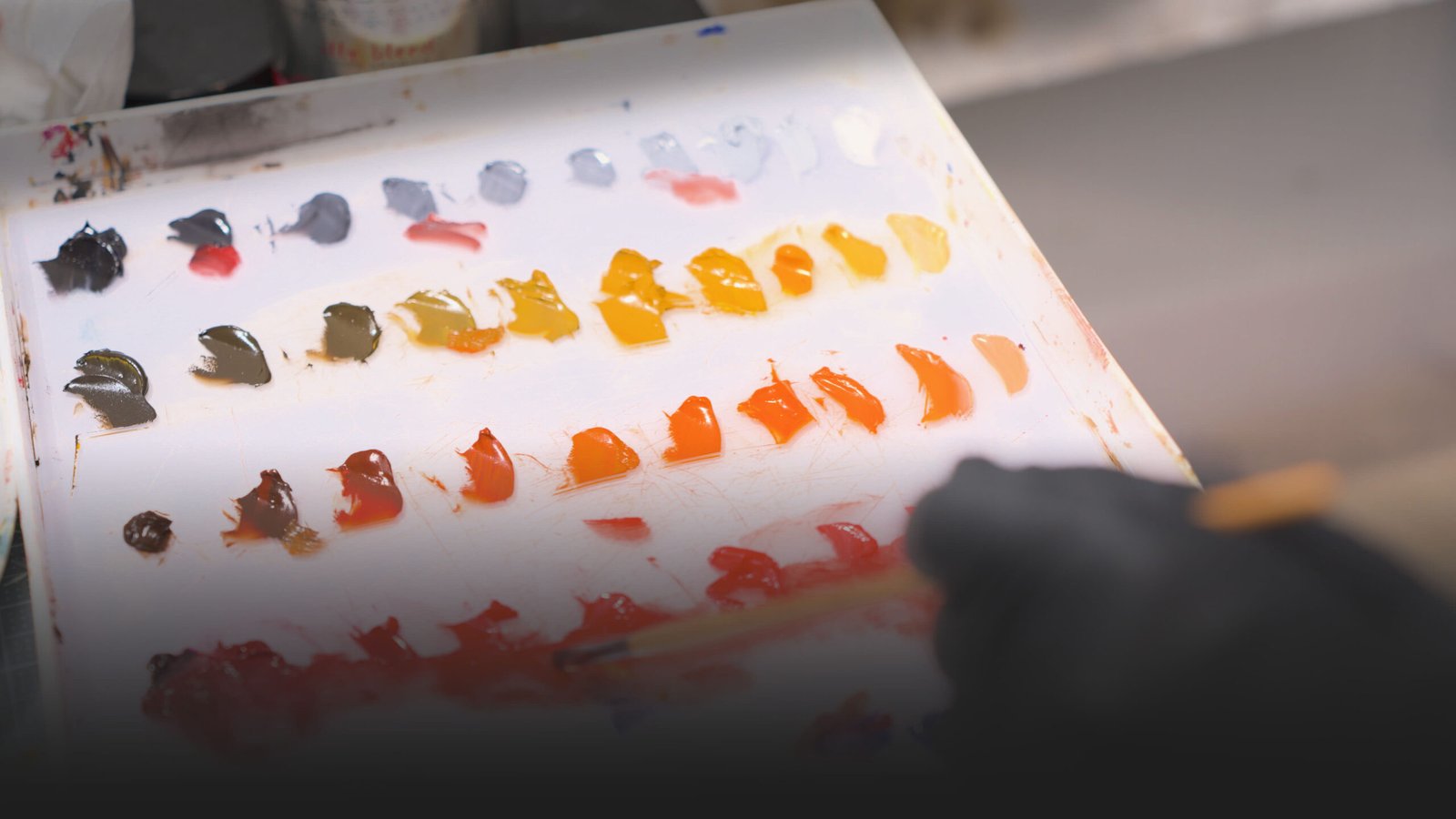
The Secret of Realistic Painting
This article is primarily intended for artists who want to work in figurative art and improve their ability to represent the human figure, particularly in portraiture.
Portraiture, as well as the nude, has long been one of the fundamental areas in which artists throughout history have challenged themselves. These fields are incredibly rich in detail, knowledge, and technical advancements. It is therefore no surprise that some artists have reached such an extraordinary level of mastery that their work can seem almost impossible to match.
So, where should we begin? How can we develop a greater ability to represent the human form? How can we make our portraits feel more lifelike, more convincing, more realistic?
That is what I explore in this article.
What Matter More Than Details in Realistic Painting
If you think it’s the details that make the difference in a realistic painting, you might want to reconsider.
In reality, what truly makes the difference in a painting are the values. They are what create the illusion of three-dimensionality.
Because, ultimately, realism is simply the correct translation of a three-dimensional world into a two-dimensional one, which is the canvas.
And perspective, together with the variation of light that creates the illusion of depth, is the real work of the artist.
So, regardless of color and saturation, the first approach should be about values.
Therefore, one of the most basic pieces of information about painting, and one of the most fundamental concepts, is value.
One of the most challenging exercises that you will have to face is understanding, capturing, and rendering the correct values.
What Is Value in Art?
I have a complete dictionary entry for this word, but in a few words, value represents the relative lightness or darkness of a color or an area within an image.
Value represents the relative lightness or darkness of a color or an area within an image.
As I mentioned before, value is what allows us to represent form, which means the three-dimensional structure of a figure.
Do you understand now why this is one of the most important aspects of painting?
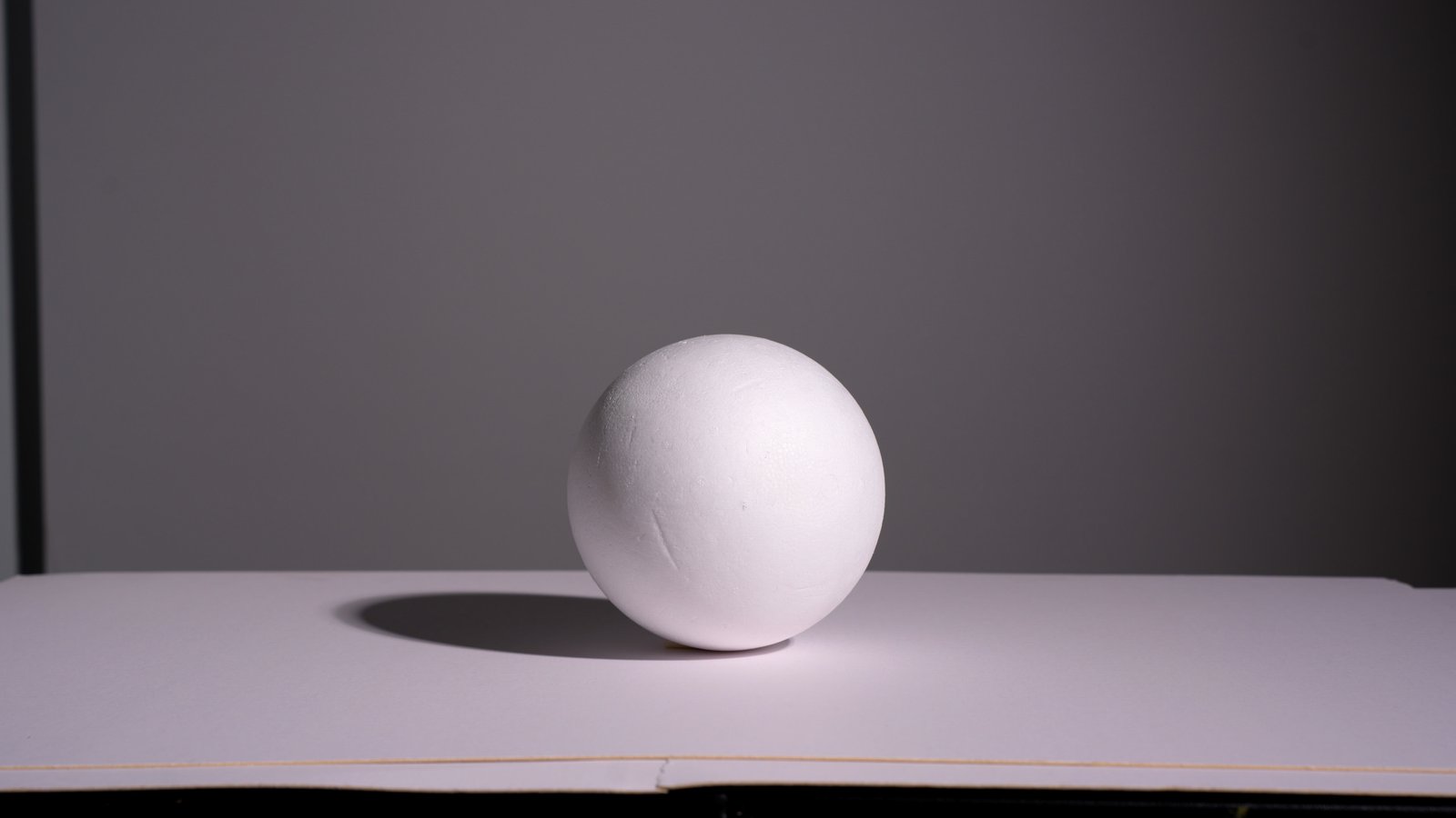
Because without value, you don’t have three-dimensional form. Without three-dimensional form, you don’t have realism. Without realism, your image, your painting, your portrait, or your figure can appear flat or incorrect.
We’re so used to perceiving values that our visual system is extremely sensitive to them. We instantly feel whether an image looks right or wrong based on the organization and accuracy of the values within the picture we are creating.
The Value Finder
Now that you understand the importance of value, it’s time to put it into practice.
I created this tool to help myself identify the correct values, and it is based on the Munsell system.
Now, I have an entire online course on the structure of color, so you can check out the course here. But I can give you some basic information.
This tool helps identify the relative degrees of light and dark, making it easier to understand and paint form.
You use it by taking a wooden stick and priming it with some gesso. Then, you divide it into 11 little squares. Those squares represent the values from pure black to pure white, where pure black is 0 and pure white is 10. This is the Munsell value scale.
You use this stick by squinting your eyes and comparing it with any color or area of your painting to identify its correct value.
Because one thing that I didn’t mention is that value and hue are two different attributes of color.
Every chromatic color has a hue, and hue refers to the color family, such as red, purple, yellow, green, and so forth.
So, when you squint your eyes, you can identify the value of a color regardless of its hue. This allows you to easily detect if you are moving in the wrong direction or if you have achieved the correct value relationship.
This is how simple this tool is.
I hope this helps. Let me know, and obviously, you can subscribe to my newsletter to receive these perks and free lessons directly in your email every week.

Stop Guessing Colors: The Formula That Changes How You Mix Paint
The goal of this article is simple: to help you gain more control and confidence when mixing and creating colors in your paintings.
This Procedure works for both Oil Colors and Acrylics!
Many artists, especially in the early stages of their journey, run into the same problem: mixing colors accurately.
With thousands of paints available in stores, I completely understand the confusion (and the frustration). If you’ve ever ended up with a palette full of dull, muddy, or simply “wrong” colors, you know exactly what I mean.
The good news is that this isn’t a lack of talent: it’s usually the result of an unstructured approach to color mixing. The internet is an amazing place: endless videos, endless artists, each with their own method… but is there a simple, reliable system?
Today I want to share a method that gives you much more control over color: separating the process into two distinct phases: value and color (hue and chroma).
Why Colors Become Muddy
Unlike light, which combines additively to produce white, pigments behave in a subtractive way. Each color absorbs certain wavelengths of light and reflects only what remains.
When we mix two pigments, each one absorbs certain parts of the light spectrum. In the mixture, these absorption patterns combine, so even more wavelengths of light get absorbed before anything reaches our eyes. As a result, less light is reflected overall, and the color often loses brightness and saturation, appearing more muted or gray. This is why mixes that seem logical on paper can sometimes end up looking dull in practice.
In painting, we also cannot reproduce the intensity of natural light. For this reason, much of our work revolves around building a range of colored grays, balancing warm and cool variations to create depth and realism.
The Separation Method: Value First, Color After
The core idea is simple: instead of chasing the final color immediately, we separate the process into value and chroma.
1. Establish the Value
The first step is to create a neutral gray that matches the brightness of the color you want to achieve.
Using white and black, you define the correct level of lightness. This gray becomes your reference point and ensures consistency throughout the process.
A key principle emerges immediately:
if the value is wrong, the color will almost never look right.
2. Align the Hue
Next, you mix the target color, for example, combining red and yellow to create a warm orange base often used in skin tones.
Then you adjust it until it matches the same value as the gray you prepared earlier.
In practice, both mixtures must share identical brightness.
3. Control the Saturation
Now comes the most interesting part.
When you mix the gray with the color, the value stays stable because both start from the same brightness level. The only variable that changes is saturation.
This gives you the ability to increase or reduce chroma without disturbing the tonal structure of the painting.
The result is far more precise and predictable color control.
The Secret of Realistic Portraits
When we look at a face, we perceive many subtle color shifts: yellow on the forehead, red on the cheeks, violet tones around the jaw or in the shadows.
Many painters focus too much on these chromatic differences, forgetting that what truly builds form is the relationship between values.
For this reason, this method simplifies portrait painting into five main value groups:
- Main light
- Light midtone
- Dark midtone
- Shadow mass
- Dark accents
Once these levels are established, each area can be colored while maintaining a strong tonal structure.
The Importance of Colored Grays
One of the most powerful insights is that the most compelling painting effects rarely come from pure, saturated colors.
True visual richness comes from subtle variations between warm and cool tones, slightly desaturated colors, and controlled accents.
These “colored grays” are what create volume, depth, and realism.
A realistic skin tone is a complex network of temperature shifts constantly balancing each other.
For this reason, this method simplifies portrait painting into five main value groups:
- Main light
- Light midtone
- Dark midtone
- Shadow mass
- Dark accents
Once these levels are established, each area can be colored while maintaining a strong tonal structure.
I hope you enjoyed this article. Feel free to drop any questions in the comments below.