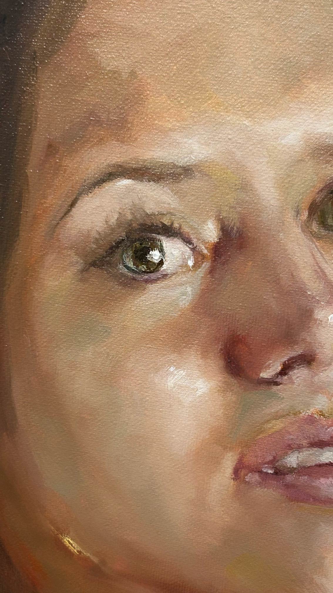
Skin colors (Essay)
Skin is one of the most challenging subjects an artist can face. Not because it is impossible to understand, but because it is often approached without a clear structure.In this article, we break it down into something you can actually control.
What Skin Color Really Is
Skin color is not a single color. It is a system of relationships. And if that already sounds complex, it gets more interesting.
Genetics, age, health, lifestyle, blood circulation… and then light. Always light.
What we call “skin tone” is the result of all these elements working together, constantly changing. There is no fixed color. There is a condition.
As a painter, you need to make a shift.
You are not painting skin. You are painting how light behaves on a complex, layered surface.
This is why it takes time to master. Not because it is mysterious, but because it requires control.
The Illusion of Complexity
Skin is complex. That part is true. But complex does not mean unmanageable.
Many artists believe they need endless mixtures and subtle variations to paint skin. And that’s where they get stuck.
The issue is not the amount of information. It is how that information is organized.
What looks like complexity is often just a lack of structure. Once you start seeing patterns, everything changes.
Skin is not chaos. It follows consistent rules.
Value, Hue, and Chroma
Like mentioned before, every color can be understood through three dimensions:
- Value is how light or dark it is.
- Hue is its position in the color spectrum.
- Chroma is how saturated or neutral it is.
Skin tones live within a specific range of these three.
Value builds the structure. Hue gives direction. Chroma controls intensity.
If you control these, you control skin.
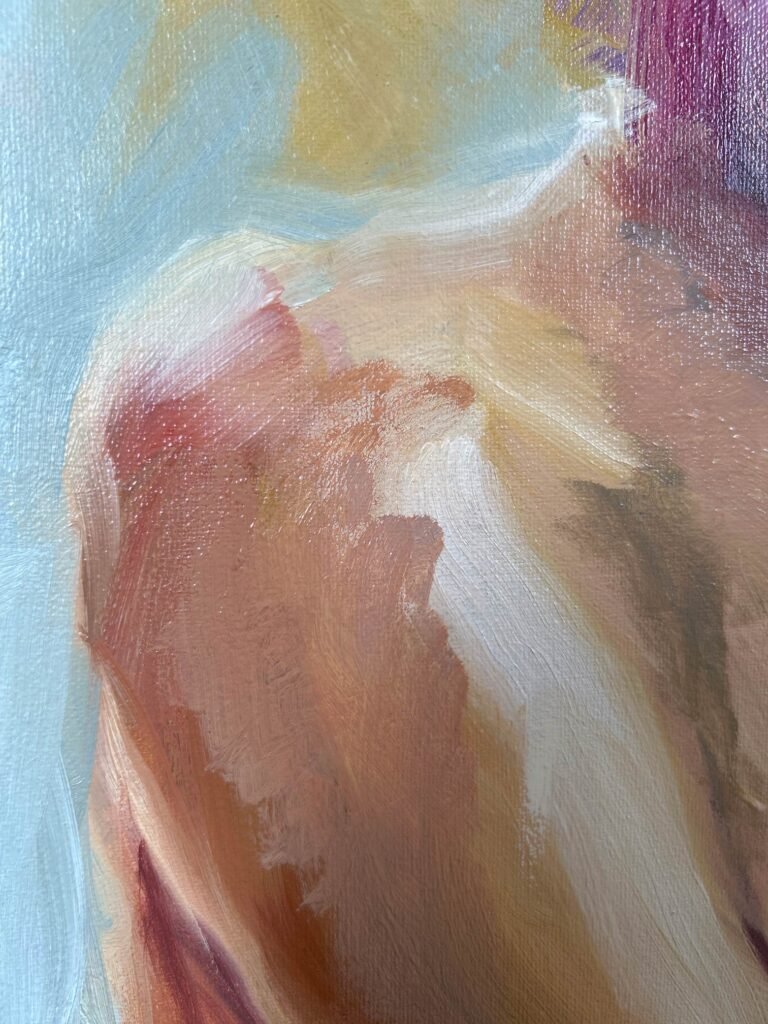
Why Three Scales Are Enough
Instead of thinking in hundreds of colors, we can simplify skin into three main systems:
- The yellow scale.
- The red scale.
- The neutral scale.
The neutral scale is the foundation. The yellow and red scales expand your control.
These three are enough to describe most of what we see.
Not because skin is simple, but because its variations stay within these ranges.
You are not simplifying reality. You are organizing it.
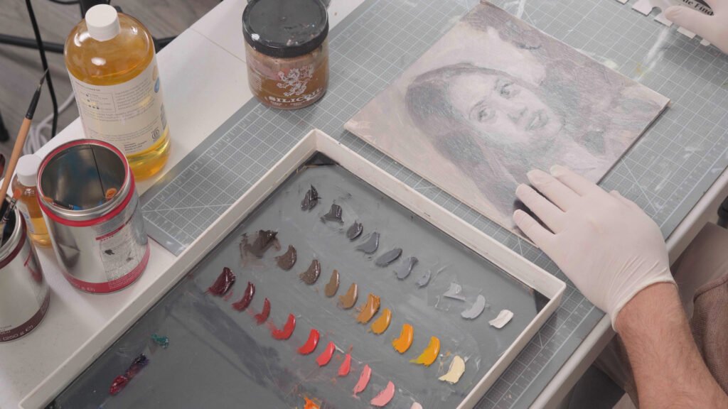
The Yellow Scale
The yellow scale is about light. Areas exposed to light tend to shift toward yellow. Especially planes facing the light source.
Yellow holds value well. This makes it essential for building stable light areas. If the light is not solid, nothing else works.
The Red Scale
The red scale is about blood. You see it where the skin is thinner or more active: cheeks, nose, ears, lips, fingers.
Red is not everywhere. But where it appears, it matters. It brings variation. It brings life. Without it, skin looks flat.
The Neutral Scale
The neutral scale is what holds everything together. Most of the skin is not highly saturated. It is more neutral than we think.
Neutrals control value. They create smooth transitions.
If everything is saturated, the painting breaks. If everything is neutral, it dies. Balance comes from controlling both.
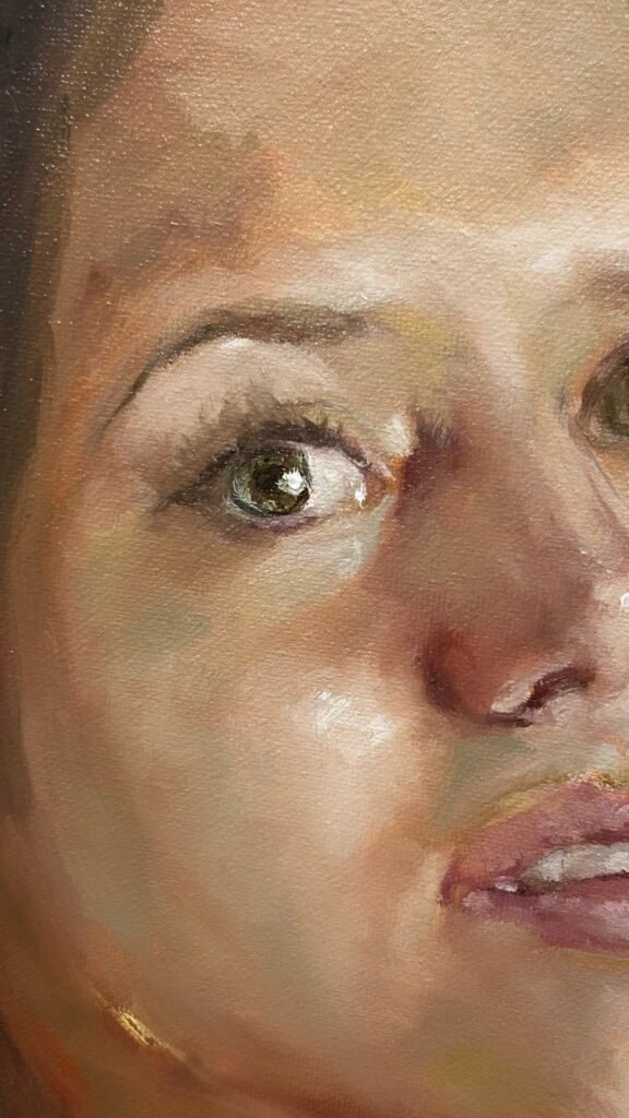
Bringing Everything Together
These three scales do not work separately. They work together. Yellow builds the light. Red brings life. Neutral creates structure.
With small additions of green and blue, you can cover most real situations.
You don’t need more complexity. You need more control.

Creating a Yellow Scale
Explore how to construct a yellow scale while maintaining clarity and control.
Learn how yellow shifts quickly in value and how to manage its sensitivity without breaking the structure.
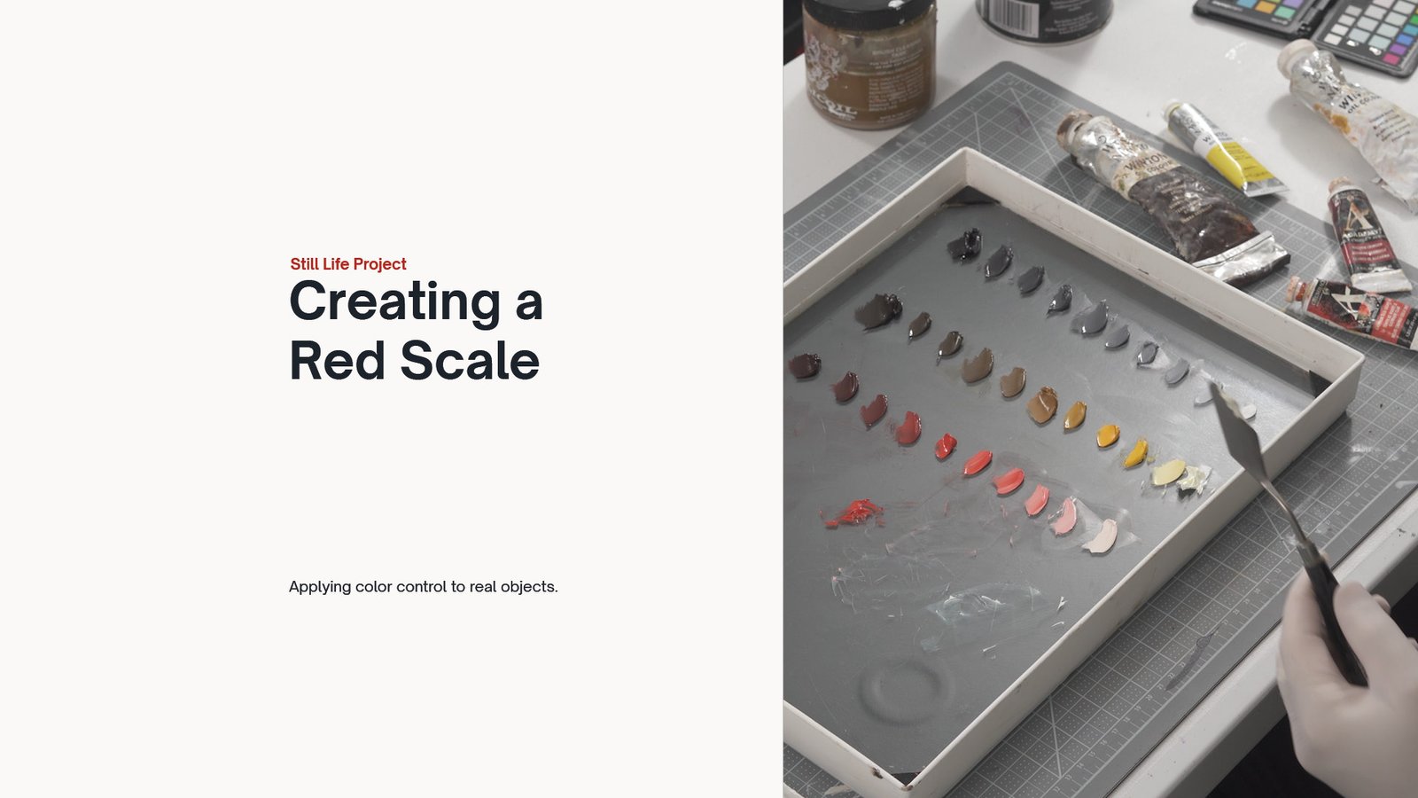
Creating a Red Scale
Learn how to build a controlled red scale by adjusting value and chroma step by step.
Understand how red behaves across light and dark, and how to avoid losing intensity while mixing.