
The Reilly Palette: Understanding the Reilly Neutrals
One of the biggest challenges in painting is learning how to control light and shadow. Colors may be beautiful and carefully chosen, but if their values are wrong, the illusion of form begins to fall apart.
This was one of the central ideas behind Frank J. Reilly‘s approach to painting. He believed that value played the most important role in creating the illusion of three-dimensional form on a flat surface. In his view, 80% of the result came from getting the values right, 20% from chroma, and none from hue.
To help artists develop this control, Reilly introduced a system known as the Neutral Control, built around a carefully organized scale of neutral values.
A system built around eleven values
The Reilly Neutral scale consists of eleven steps, ranging from pure black to pure white.
Black represents value 0, white represents value 10, and the nine intermediate steps fill the space between them.
The goal is to keep each step visually equidistant, creating a reliable reference for judging light and dark relationships in a painting.
But these neutrals are not simply made by mixing black and white.
Reilly’s system uses two different combinations of pigments:
- Titanium White and Ivory Black produce a series of cool grays with a slight blue bias.
- Titanium White and Raw Umber produce a series of warm grays with a yellow bias.
By combining the corresponding values from these two scales, the artist can create a third series of neutrals. The proportions are adjusted by eye until the warm and cool tendencies balance each other, producing a neutral color with minimal hue bias.
A north-facing natural light source can be particularly useful when judging these mixtures, helping the painter evaluate their neutrality more accurately.
Why neutral colors matter
The purpose of the Reilly Neutrals goes beyond establishing a value scale. They also provide a practical way to control the chroma of colors.
Oil paints often come straight from the tube with a high degree of saturation. While strong colors have their place, painters frequently need more subdued versions of those same colors.
Adding a neutral of the appropriate value allows the artist to reduce chroma while maintaining the original hue and controlling the value relationship.
Consider a simple example: suppose you want to create a muted purple at value 5, with a chroma level of 6 (P5/6).
You could begin with Dioxazine Purple, identified as P1/12, and add Titanium White until the mixture reaches value 5. Then, gradually introduce Neutral 5 until the purple reaches the desired level of chroma.
This approach gives the painter a more systematic way to adjust color, rather than relying on random mixtures or adding complementary colors that may shift the hue.
It is also important to understand Reilly’s terminology. He used the word neutral to describe a color without a significant hue bias. The word gray, on the other hand, can also refer to a weakly saturated color that still carries a recognizable hue.
Preparing the Neutrals Scale
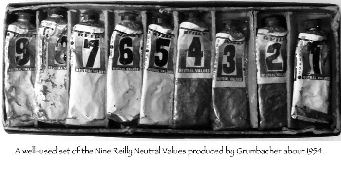
The system was once available as a commercial product. In the late 1940s, Frank J. Reilly arranged for Grumbacher to manufacture boxed sets containing the nine intermediate Reilly Neutral values.
Those sets are no longer available, but making your own is relatively straightforward. Preparing them in advance can save considerable time during painting sessions and help maintain consistency across your palette.
Understanding how neutrals work is an important step toward understanding the deeper structure of color. The Reilly Neutrals offer a practical way to explore the relationships between value and chroma, two elements that influence how colors interact and how we perceive them.
The process of creating the Reilly Neutrals scale, understanding how to achieve true neutral colors, and learning how to use them to control chroma are all explained in detail in The Silent Structure of Color.
The course explores these concepts and many other aspects of color theory, helping you understand how color works and how to apply that knowledge to your paintings.

