Simultaneous Contrast: How Surrounding Colors Influence Perception
One of the most fascinating aspects of color theory is that we never truly perceive a color in isolation. What we see is influenced by the colors surrounding it. A color may appear lighter or darker, warmer or cooler, more saturated or more muted, depending on the colors placed next to it.
This phenomenon is known as simultaneous contrast, a fundamental principle of color theory that plays an essential role in painting, visual perception, and design.
Understanding simultaneous contrast allows artists to look beyond individual pigments and begin to understand color as a system of relationships.
Let’s start with a simple gray strip. As you look at the following image, follow the strip from left to right across the background. Do you notice anything unusual?
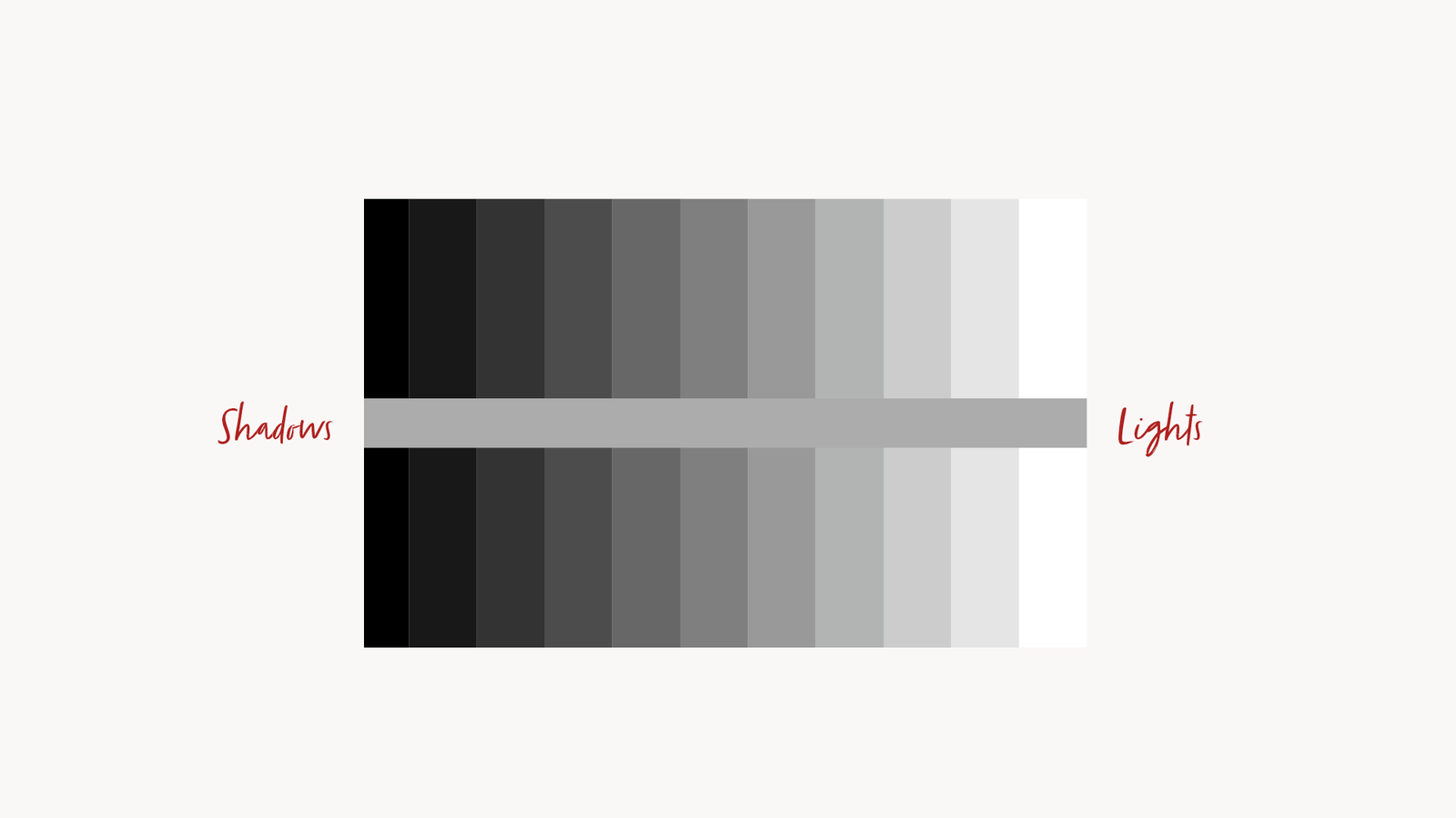
The strip appears to become progressively darker as it moves toward the right. And yet, its actual value never changes. What changes is our perception, shaped by the contrast between the strip and the values surrounding it. The very same tone can look lighter or darker depending on the context in which we see it.
What Is Simultaneous Contrast?
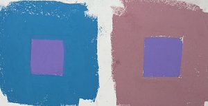
Simultaneous contrast describes the phenomenon in which a color appears different depending on the color immediately surrounding it.
When two different colors are placed next to each other, our visual system automatically compares their characteristics. As a result, their perceived appearance changes according to their interaction.
This influence can affect three fundamental properties of color:
- Hue: A color may appear to shift toward a different color family depending on its surroundings.
- Value: A color may appear lighter or darker depending on the relative brightness of the adjacent color.
- Saturation: A color may appear more vivid or more muted depending on the intensity of its surroundings.
In other words, the color we perceive is not determined exclusively by the pigment itself, but also by its visual context.
The Historical Origins
 The principle of simultaneous contrast is closely associated with the work of Michel Eugène Chevreul, a French chemist who extensively investigated the interaction of colors.
In 1839, Chevreul published The Principles of Harmony and Contrast of Colours, a landmark work that explored how colors influence one another when viewed simultaneously.
His observations had a significant impact on painting, textile production, and the development of modern color theory. Artists subsequently explored these principles to create more complex and controlled color relationships.
This influence can affect three fundamental properties of color:
- Hue: A color may appear to shift toward a different color family depending on its surroundings.
- Value: A color may appear lighter or darker depending on the relative brightness of the adjacent color.
- Saturation (chroma): A color may appear more vivid or more muted depending on the intensity of its surroundings.
In other words, the color we perceive is not determined exclusively by the pigment itself, but also by its visual context.
Why Is It Important for Painters?
For painters, simultaneous contrast has very practical consequences.
A color that looks perfectly balanced on your palette may appear considerably different once applied to the canvas. The same mixture can look warmer, cooler, lighter, darker, or more saturated depending on the colors surrounding it.
This is particularly important when painting skin tones.
For example, a neutral flesh tone placed against a green background may appear slightly reddish by comparison. The same flesh tone placed against a reddish background may appear less warm or even slightly greenish.
The pigment mixture has not changed. What has changed is our perception of it.
This is why painters should avoid judging colors independently. Instead, they must constantly evaluate how each color interacts with the surrounding areas of the composition.
Simultaneous Contrast in Practice
There are several ways to observe simultaneous contrast in practice.
- Value relationships
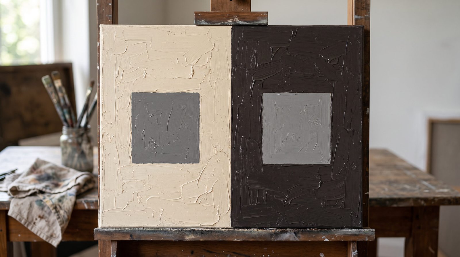
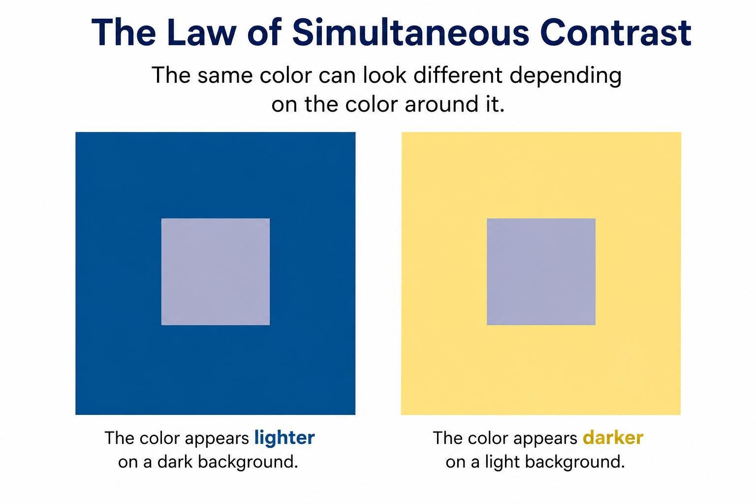
Place an identical gray square against a light background and then against a dark background. The gray will appear darker against the light background and lighter against the dark one. - Hue relationships
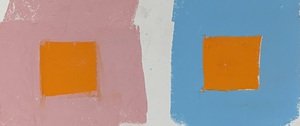
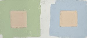
Place the same color against two different surrounding hues. Its perceived color will shift depending on the chromatic characteristics of the background. - Saturation relationships
Place an identical saturated color against backgrounds with different levels of chromatic intensity. Its perceived intensity may change as a result of the surrounding colors.
These simple exercises demonstrate why color perception is relational rather than absolute.
The Checker Shadow Illusion
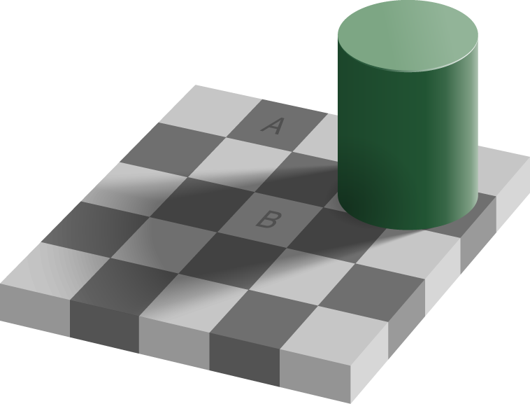
A fascinating example of how our visual perception can be influenced by surrounding elements is the Checker Shadow Illusion, created by vision scientist Edward H. Adelson. In this famous optical illusion, two squares on a checkerboard appear to have completely different shades: one looks considerably darker than the other. However, they are actually identical in color and value.
The illusion occurs because our brain does not interpret each square independently. Instead, it takes into account the surrounding squares, the shadow cast by the cylinder, and the perceived lighting conditions of the scene. Our visual system automatically compensates for these contextual factors, altering how we perceive the actual value of each square.
This is an excellent demonstration of why we cannot judge a color or value in isolation. What we perceive is strongly influenced by its surroundings, making the Checker Shadow Illusion a particularly clear example of simultaneous contrast and contextual color perception.
A useful practical technique: Isolating Color and Value
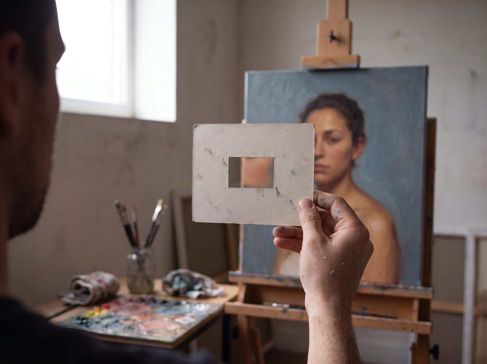
One simple technique I recommend is to create a small viewfinder using a piece of neutral gray cardboard with a hole cut into it. By placing this window over a color or a specific area of a painting, you can isolate that portion from its surrounding context and evaluate its value or hue more objectively.
This technique helps reduce the influence of simultaneous contrast and makes it easier to judge whether a color is actually lighter, darker, warmer, or cooler than you initially perceived. It is particularly useful when comparing subtle value transitions or checking color mixtures.
Final Thoughts
Simultaneous contrast reminds us that color is never a fixed fact. It is a relationship. The same mixture can look warmer, cooler, lighter or darker depending on what sits next to it, and your eye will always be tempted to trust the first impression.
So here is what I suggest when you paint. Never judge a color on its own. Step back and look at it in context. When something feels off, isolate it with your gray viewfinder, check it again, and then put it back in its place on the canvas.
Over time, you stop asking “What color is this?” and start asking “What is this color doing next to its neighbors?” That is the moment you begin to see like a painter.
Next time you mix a skin tone, try this: look at it on the palette, then look at it on the canvas, and notice how much it has changed. The pigment is the same. Only the context is different.

